|
|
|
|
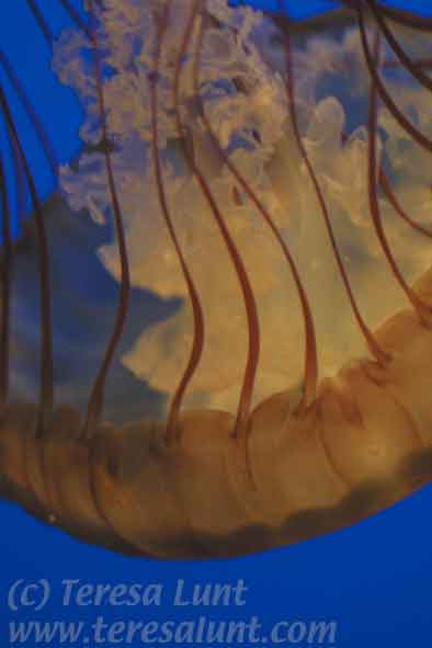
Earlier we worked with an image of a jellyfish taken in the Monterey Bay Aquarium in Monterey, California. This time we will work with another photograph of a jellyfish, also photographed in the Monterey Bay Aquarium, which has amazing huge and colorful displays of jellyfish that are like living pieces of art. This photograph was taken with my Canon D30 digital SLR camera. The original photo can be seen in Figure 1. It is a closeup of a jellyfish, one among hundreds that drifted seemingly aimlessly through the wall-to-ceiling display.
|
|
|
|
 |
| Figure 1 |
|
Again, I had to deal with difficult shooting conditions. The light was very dim, and the jellies are constantly moving, both drifting through the water and regularly contracting in a pulse-like movement that serves to propel them on their way. Shooting in these conditions requires using a high ISO setting (film speed analog), in order to use a fast enough shutter speed to minimize motion blur. In addition, it helps to get closeups of the larger jellies as they pass directly under the lights, to maximize the amount of light entering the camera. To get close, you have to use a macro lens, which allows you to focus the lens very close to the subject. I did not attempt to use a tripod, because the museum is always very crowded, and a tripod would just get in people's way. In low light, working hand-held, with a moving subject, it helps to brace yourself and the camera against some object, such as the glass of the aquarium tank.
As you can see from Figure 1, the original photo is way too dark and poorly framed. Also there is considerable noise in the image, which is the result of using a high ISO setting for the picture. I want to correct the composition and lighten up the image. I want to clean up the noise, and also select more pleasing colors. I am not concerned here with reproducing reality. Instead, I want to find colors that make the image more lively and that give the image a softer, more pleasing quality. One of the things I like about this image is the feeling that the jelly is lit from within. I want to preserve and even enhance this feeling in the final image. I would also like to give the image a more dreamlike, less literal quality.
My goal is to make the final image look like a watercolor painting with enough detail to be interesting.
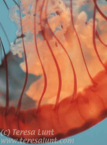
The first thing I did was to correct the composition. First, I cropped off much of the empty blue space at the bottom of the image. Then, I used Edit>Transform>Skew to stretch the top of the image, pulling some of it out of the frame. This gets rid of some of the annoying detail in the upper right part of the original image, and also lets the glowing center of the jellyfish fill up more of the frame. Next, I used the Image>Adjust>Channel Mixer to alter the colors. The Channel Mixer is a powerful tool that requires a lot of experimentation in order to achieve the results you want. Here, I used it to reduce the amount of blue in the image and to increase the amount of red in the image. I was also able to increase the overall brightness of the image by having some of the channel mixes add up to more than 100%. Each image requires its own treatment. You can get an idea of how you might want to mix the channels if you first go to the Channels palette and look and the Red, Green, and Blue channels separately. After some trial and error, I produced the result you can see in Figure 2.
|
|
|
|
 |
| Figure 2 |
|
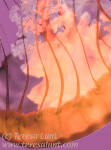
While I like these colors, I wanted to make a more radical departure from reality. So I used Image>Adjust>Channel Mixer a second time. This time I shifted the blues towards violet, and the reds towards orange. I also used Image>Adjust>Hue/Saturation for fine adjustments of the color, and to increase the overall color saturation. Generally I prefer to use the Channel Mixer for big changes in color, to get me close to where I want to be, but I find it hard to use Channel Mixer to be precise about the final color result. So then I generally use Hue/Saturation to fine-tune the resulting color. But I try to use Hue/Saturation sparingly, especially with a noisy image, because using Hue/Saturation to make big color changes can enhance the noise in your image. You can see the results so far in Figure 3.
|
|
|
|
 |
| Figure 3 |
|
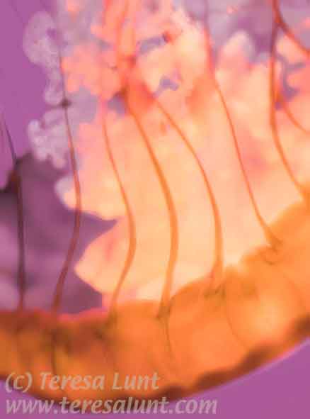
Figure 3 still shows a fair amount of noise. So our next step will be to try to smooth out this noise. We start by creating a duplicate layer in Photoshop (Layer>Duplicate Layer). On this duplicate layer I used the Paint Daubs filter (Filter>Artistic>Paint Daubs) at the maximum brush size, minimum sharpness, and selecting the wide blurry brush from the filter's menu. The use of the Paint Daubs filter has the effect of removing much of the image's detail, including removing the image noise. However, I want to keep some of the detail. To keep some of the detail from the bottom layer, we will create a layer mask for the upper layer to mask out some of the upper layer where we want detail from the bottom layer to show through.
We create a layer mask for the upper layer, using "Reveal All." With this option, the layer mask is all white. We will use the Paintbrush tool to paint black paint onto the layer mask. Where we paint on the layer mask, the lower layer will show through. First we select black as the foreground color, in the Color Picker (indicated by the two big boxes in the main toolbar: the upper left box is the foreground color, the lower right box is the background color. To choose a foreground color, click on the upper left box and the Color Picker will come up. Click on black to select that as the foreground color. The Paintbrush tool automatically uses the foreground color to paint with.) Now, select the Paintbrush from the Tools palette. In the Layers palette, click on the all-white layer mask for the upper layer and start painting on it. Paint black on the layer mask wherever you want the bottom layer to show through. In this image, I only want the non-noisy areas of the bottom image to show through. I also want certain areas of sharp detail to show through, such as the long ribbon-like strands that rise vertically from the large mass of the jellyfish in the lower portion of the image. But I wanted to keep the softness of the filtered upper layer in the upper part of the image, where the lower layer was too sharp. This will give a dreamier quality to the fluffy interior of the jelly.
When using the Paintbrush, I find it easiest to use a pen input device, such as the Wacom tablet. This makes using the Paintbrush feel just like drawing with a brush or crayon in your hand. When painting on the layer mask, it helps to choose a very large brush size to start with, so you can quickly cover large areas. Then, when you need to paint on smaller details, you can pick a smaller brush size. In this image, I needed a small brush to paint back in the details from the lower image, such as the ribbon-like strands that vertically partition the image.
Pick a medium opacity for your brush. This way you can paint several strokes over each other until you get just the right amount of see-through to the layer below. If you paint more than you intended on the layer mask, you can undo some of your work by selecting white as the foreground color and painting white onto the layer mask. Painting white onto the layer mask has the effect of hiding the lower layer and showing the upper layer. You can alternate between painting white and black on the layer mask, perhaps using different size brushes, until you get exactly the effect you want. You can compare the effect before and after the layer mask by disabling and then enabling the layer mask (Layer>Disable Layer Mask and Layer>Enable Layer Mask). When I am through, I flatten the image to combine the layers using Layer>Flatten Image. You can see the results so far in Figure 4. In Figure 4, the noise has been suppressed, but I was able to keep some detail where I wanted it. But overall, there is a loss of detail and an increased dreamlike, painterly effect.
|
|
|
|
 |
| Figure 4 |
|
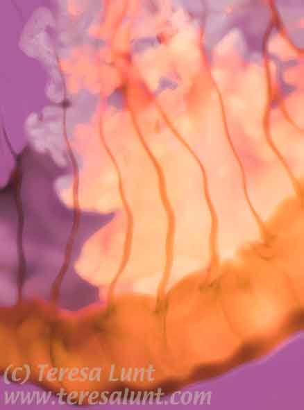
I really like what we have achieved so far. The colors are beautiful and vibrant, and we have achieved the watercolor effect we were after. But I wanted to add just a bit of extra punch and interest to this image. One of my favorite effects is distortion. I like to give just a slight hallucinogenic effect using the Wave filter (Filter>Distort>Wave). I used the wave filter with five generators, setting the wavelengths between 85 and 270 and the amplitude between 5 and 23, with the horizontal and vertical scales set to 50%. The use of relatively long wavelengths means the waves are long, loose, and lazy. The wide spread in wavelengths (85 to 270) means that the waves look somewhat random, and are not regular. The relatively small amplitudes, plus setting the scales to 50%, mean that the amount of the wave (the deviation from the unaltered image) is only slight. I also used Image>Adjust>Curves to increase the contrast just a little bit. In curves, you do this by pulling up the right-hand part of the curve and dragging down the left-hand part of the curve. To control exactly how much contrast that resulted, I then used Filter>Fade to make the final adjustment. You can see the final result in Figure 5.
|
|
|
|
 |
| Figure 5 |
|
The final image has the feeling of an explosion of light originating from within the jellyfish. The colors, while not at all realistic, are pleasing and vibrant. We have greatly reduced the amount of noise in the image, while lending it a dreamy, watercolor-like quality. Yet the jellyfish retains its detail in the sharp ribbons that dangle lazily towards the upper part of the image from the main body of the jellyfish below. The slight distortion adds a feeling of character and energy to the image.
|
|
|
|
|

|
|
| Send an e-card! |